Gamebook store

Showing posts with label covers. Show all posts

Thursday, 25 November 2021

Confounding expectations


This is my favourite Vulcanverse gamebook cover and the book doesn’t even exist yet. This is just a mock-up made using a thumbnail sketch by our artist, Mattia Simone.

Why do I like it? Partly because anyone who thinks the Vulcanverse is just a retread of Greek myth (yeah, I’d be yawning too) is going to do a double take when they see this. It doesn’t look like a classical Greek city? No, it looks a million times more exciting than that. Marble colonnades and hypostyle halls evoke the slap of sandals on a sound stage, the unconvincing clash of prop swords wielded by bad actors. Whereas Mattia's cover looks like the set of an MCU blockbuster. That could be Ronan the Accuser in front of the core of the Supreme Intelligence. It’s an image that promises nonstop excitement.

And it’s absolutely right that the fifth book should upend expectations. The Vulcanverse isn’t the world of Greek myth. It’s a Matrix-style virtual universe created by the god Vulcan (well, Hephaistos) using his hyper-accelerated development of today’s information technology. Go behind the curtain and you won’t find oxen turning wheels and steam-powered colossi from the old legends – you will find something startling and amazing and all-new. Something that coruscates with Kirby krackle, that whips the rug out from under you, that takes your breath away and blows your mind for good measure. This is not some lame old 1980s stop-motion movie with a bleeping owl. It’s the American Gods or Anansi Boys of Greek myth, the reboot that brings it up to date at warp speed. And that’s why Mattia’s cover is so perfect. It says: this is not your father's Greek mythology.

While we’re talking about the Vulcanverse books, eagle-eyed gamer Teófilo Hurtardo has pointed out some sloppy syntax in the second one, The Hammer of the Sun. If you get yourself killed, your god arranges to resurrect you and the text says:
‘If you were wounded, untick that box on your Adventure Sheet, but add 1 to your total scars because none returns from the land of death without being marked.’
What I meant there was that everybody coming back to life gets a scar, regardless of whether or not you were wounded when you died. But Teófilo rightly pointed out that’s not what I said. It might just about pass in everyday conversation, but not in a book where the precise logical syntax matters.

So what it should say is:
‘Add 1 to your total scars and, if you were wounded, untick that box on your Adventure Sheet.’
I’ll correct it in future editions. And this is a good moment to thank John Jones, who generously cast his diligent eye over the Vulcanverse books and caught a number of critical errors in The Wild Woods, some of which spread back in time to book one, The Houses of the Dead. For example, there's the ubiquitous demon Wolfshadow, who was supposed to be killed (in book one) based on advice given to you in book three by King Lykaon -- except that advice and the associated codeword had been missed out. Eek. John suggested a good way to fit the advice into the long spiel that King Lykaon actually delivers in book three:
'Despite my title, there is one wolf I do not rule...' leading into telling you about Wolfshadow and, 'Hey, take one of these arrows of Artemis to King Midas's tomb in Hades to maybe get gold-plated so you can kill that nasty thing why don't you? Oh, and don't forget to fetch along an actual bow, either.'
Unfortunately I'd already done the page layout, so I couldn't make use of John's elegant suggestion and we have to make do with Lykaon just mentioning Wolfshadow in passing. But at least you get the codeword so the book isn't actually broken.

John also took us to task, and rightly so, over the random permadeath the player suffers if they stray into the Slimeswamp without any vinegar. The only possible way to find out that you need vinegar there is to lose a character and have to start all over again. Not a lot of fun if you've just spent hours questing around the other books. John proposes this fix, which we fully endorse. Paste it into your copy of book one if you wish:


I'm barely scratching the surface of all the help John has given us with these books. He's the true hero of the Vulcanverse, and you can bet that after the final book is out I'll resign the position of gamebook editor permanently -- and thankfully!


Also at Blackwell's UK:
And at Barnes & Noble in the US:
Also of interest:

Circe by Madeline Miller
Democracy by Abraham Kawa and Alecos Papadatos
Helen of Troy (Harrison, 2003)
Heroes and Mythos by Stephen Fry
Homer's Daughter by Robert Graves
Jason and the Argonauts (Chaffey, 1963)
The Odyssey (Konchalovsky, 1997)

Friday, 23 October 2020

The Mountains of Instead

The title of the post is a line from an Auden poem, "Autumn Song", which in one version concludes:
Clear, unscaleable, ahead
Rise the Mountains of Instead,
From whose cold cascading streams
None may drink except in dreams.
There's a different version of the last verse if you're interested. Every so often a poet just can't bring themselves to abandon a work -- think of FitzGerald's endless tinkering with the Rubaiyat. ("The Moving Finger writes..." And gets endlessly rewrit, eh, Eddie?)

It's not just poets. John Whitbourn asked me to put together a cover for his new book Altered Englands, a collection of short stories from his thirty-year career as one of Britain's foremost fantasy authors. Acutely conscious of the honour, I vacillated between half a dozen designs. I started with the painting above by Albert Gleizes, which I thought had a nicely skew-whiff cricketer vibe, but Gleizes isn't in public domain for another three years. Darn it.

So then I tried using this cakes-&-ale image by John Currie, but that was too much of "England" and not enough of the "Altered" and eventually it got rejected in favour of Eric Ravilious's take on the Long Man of Wilmington. Over the centuries the Long Man has altered quite a bit in appearance, and certainly nowadays he's no work of art (unlike the White Horse, say) but there are still some who believe the figure predates the early modern period. John tells me that one interpretation is that he's not holding a couple of staves but in fact standing guard in a doorway, a role I remembered from The Sandman #19 by (do I need to tell you?) Gaiman and Vess:


The door the Long Man is opening in this case is onto a varied selection of stories ranging from the darkly horrific to the purely marvellous and always with the author's startling imagination and sparkling humour inviting you into a state of total immersion.

Among the stories is the very last of the Binscombe Tales, never published before. Altered Englands is an eclectic, idiosyncratic and erudite mix, as you'd expect of the author, with subjects that range from Binscombe to Bratislava, from Allah to evolution, from Stalin to Sussex, and from castle lords to Charleston. And just when you think you have the measure of John Whitbourn's interests, he surprises you by throwing in a shaggy-dog yarn about none other than Jimi Hendrix. A bonus is that every story comes with the author's notes, which further reveal his lively imagination, wide reading and profound deliberation. Trump- and Brexit-supporting readers of this blog who complain about my occasional political posts might be pleased to discover that John holds diametrically opposite views on politics, ethics and even science/religion (I'm Starfleet officer, he's New York street cop) and only one of us has ever been photographed wearing black nail varnish and mascara*. 


Talking of Charleston, Jamie lives near Firle in Sussex and a few years ago we took a look around both Charleston itself and the nearby Monk's House in Rodmell, home of Leonard and Virginia Woolf. One of the paintings we came across there is this mysterious image, which the curator described to me as The Liverpool Ghost but which is actually A Man with His Horse, and a Boy. Why mysterious? Why "ghost"? Take a closer look. It obviously intrigued the Woolfs and it suggests for me an encounter between H P Lovecraft and the Bloomsbury Group. That particular story isn't in Altered Englands, but there is one featuring Lytton Strachey. Didn't I say eclectic?

Here are strange and elementally wondrous tales to "stain the wind with leaves", as another poet put it. With Halloween coming and the nights drawing in it's the perfect fireside read. If we could dig Auden up for a quote I have a feeling he'd shout: "Trolls run scolding!" Don't let 'em get there first.

Friday, 7 September 2018

Critical IF cover design

Following on from the previous post, here are the cover briefs I sent to Jon Hodgson when Fabled Lands LLP decided to republish the Virtual Reality books overselves rather than partnering with Osprey to do them.

*  *  *

These are my initial ideas. I’m open to any suggestions or changes, as the briefs were originally prepared on the assumption I’d have to hand them off through a chain of editors and art directors at Osprey and would get no direct communication with the artist. Hence I’ve probably over-managed the details... however, here’s the cover Osprey intended for Down Among the Dead Men so you can see why I’m getting a tad control-freaky.

The top third of each cover will need to be for the author and title, and the logo extends about 2.5cm from the bottom. Maybe we should have the background and main foreground elements on separate layers, so that a hydra’s head or a sword could partially overlap the title lettering if necessary.

Ideally each book should each have a unique palette with one predominant colour to help it stand out.

Necklace of Skulls

I based the new design on the original Virtual Reality cover with these changes:
  • Removed the second (kneeling) figure. Now it's just the warrior.
  • The warrior is holding a flaming torch and a sword.
  • The view is straight-on from directly behind the warrior to make the threat of the hydra more dramatic.
  • I've put the warrior on a raised ledge of rock a few feet above the desert floor. This allows the hydra to be nearer to him and to appear to be rearing up out of a chasm.
But... it would be better not to be looking at the back of the hero’s neck. If (unlike in my sketch) one of the hydra heads were further forward, the hero could be partly turning to keep an eye on it, giving us the opportunity for a partial or full profile – just to create more engagement with him as a character:
Background and palette - as we’re looking up past the hero with a slightly low-angle shot, I think the background should be a midnight blue night sky dotted with stars. It reinforces the desert setting and astronomy is part of the mythological context of the adventure. The hydra dark-scaled. The torchlight picks out the blaze of colour (feathered head-dress, etc) in the warrior’s garb and his glistening skin, the yellow light picked up in the sand and rocks where he’s standing.

The Maya sword is made of hardwood with sharpened spikes of knapped flint or sharpened volcanic glass fixed along the edges. Just the thing for killing a hydra.

Down Among the Dead Men
A pirate fantasy adventure, a little bit earlier in history than Pirates of the Caribbean – think Elizabethan/Jacobean period. It’s pretty obvious how I’ve changed this one from the old Virtual Reality version:
  • The zombie pirate is looking straight at us.
  • He’s closer, more threatening.
  • He’s already climbed halfway over the rail.
  • The rail tilts up left to right rather than down as on the VR cover - more dramatic that way.
Put a few wisps of mist in the foreground, picking up the fog in the background. Also the original colour scheme is a bit of a dog’s dinner. We need a more limited palette to give the image more impact.

Once Upon a Time in Arabia

The classic Thief of Baghdad type adventure. It’s not even worth looking at the original cover – I never liked it. So, on to new ideas...

This drawing is a bit sketchy, so I’d better explain what’s going on. It’s a aerial shot above an Arabian Nights city looking steeply down at the towers and domes below.

Our hero is flying on a magic carpet, the wind whipping at his clothes. In one hand he has a sword. From a ring on the other hand he has called forth a genie - the swirl of smoke curls out of the ring and under the carpet, solidifying into a giant demonic figure who is ready to assist the hero.

I don’t think the hero should have a full beard (though the genie can). He should either be clean shaven or have a little hipster goatee. Or it could be a heroine (no goatee in that case). The traditional Douglas Fairbanks Arabian look, ie flowing white like the Prince of Persia used to wear before he went all moody black leather.

I envisage the genie as taking shape out of smoke that looks like a storm-cloud – dark violet/black shot through with inner flashes of lightning suggesting violence and magical power.

Overall colour palette: how about that haze of golden yellows and ochres that you get in hot, dusty climates as the sun is close to setting? If that suffuses the background, we can then pick out some bright colours (the carpet, jewels on the hero/heroine) and contrast that with the white flowing clothes of the hero/heroine and the black, billowing smoke of the genie.

Heart of Ice

The idea here is we’ve got a guy slogging through a blizzard out on the Saharan Ice Wastes towards a city in the distance. Deep snow. He’s dressed in arctic weather clothing: parka, fur-lined hood, snow goggles, etc.
He’s heard something and he’s turning back to face us to shine a flashlight at whoever or whatever is coming. (So he’s twisting at the waist, insofar as his bulky clothing will permit.) In his other hand (held out to the side so we can see it) is a barysal gun - the raygun of the 23rd century.

In the background is the place he was heading for – the city of Du-En, abandoned and empty for a hundred years. A bit Gormenghast, a bit Mountains of Madness. Massive walls, so hazed by distance and snow that the architecture (half sci-fi, half ‘30s futurist fascist) seems to render our human endeavours and dramas insignificant. We can’t see the city walls and towers that clearly because of the snow-haze.

This is a variant cover I did. Disregard the image/concept here, but I do like the colour scheme of the background. I’m thinking that this one can be the most monochrome of the series - all icy blues, whites, greys. Even the figure shouldn’t be too colourful, and possibly the only variation might be a bit of backlight from the flashlight reflected in his tinted goggles or something.

By the way, that figure - he could be the hero, he could just as easily be one of the adversaries. This is quite a morally ambiguous book and the anonymity of the figure reflects that.

*  *  *

The brief isn't the end of the story. Just like with game design, where you come up with an initial plan but then have to work out during development how to implement that and which parts work and which need changing, the cover concepts go back and forth before you arrive at something that everybody's happy with.

Take Once Upon A Time In Arabia. Jon's first sketch featured a female protagonist in historically credible but determinedly unsexy garb. Well, fair enough; we're not in the 1980s now. As Jon said:
"I went for a female character on Once Upon a Time in Arabia, which I'm kinda regretting - maybe a male would have more appeal to the readership, and I'm not keen on making a 'sexy' female character."
I agreed that a young male hero might be better, not least because I thought Jon might be more comfortable making him attractive and athletic. I went on to say:

"His clothing probably needs to be as much like the Fairbanks-style stereotypical 'Arabian adventurer' costume as you can bear to go. I know it's not historically accurate, but I'm minded of what Jonathan Miller said when staging Anthony and Cleopatra: 'I'd like to dress her in Greek-style clothing, but audiences think it's wrong if she's not in Hollywood's idea of Ptolemaic fashion.' Also, the image is going to work better if the flying carpet is moving left to right. And can we add the jinni's taloned hands for extra impact?"


Of the first Heart of Ice sketch I said:
"I like the icy colours in the cover, but would like to get a real raging blizzard. It makes the situation more life-or-death -- will this lone figure even survive to reach that city..? -- and injects some doomy apocalyptic feeling into the scene."
I'm very pleased with the end result, but you can judge for yourself whether our cover creation process was a success - Jon's final book covers are here.

Friday, 24 August 2018

Blood Sword cover design

A while back I mentioned how the cover of The Lord of Shadow Keep would have been a real mess if the artist hadn’t had the sense to ignore my brief. That time I dropped the ball, but mostly I get it right. Here’s the proof, in the form of the briefs I sent to Sebastien Brunet for Blood Sword. A friendly warning: this could get technical…

COVER BRIEFS

A lot of gamebook covers avoid depicting the player-character, which makes sense as gamebooks are seen through the protagonist’s eyes. Way of the Tiger does it another way, more like the view in a third-person CRPG where you get to see the hero. Let’s do that with Blood Sword. That way we can get a sense of scale in the scenes and monsters the hero is facing.

As there are four character types to choose from in Bloodsword, we can have a different character type depicted as the hero in each cover. Then in the fifth cover maybe we could show all four. The character types are:
  • Book One: a warrior (male)
  • Book Two: a rogue (male)
  • Book Three: a sage (female)
  • Book Four: a wizard (female)

The Battlepits of Krarth
A huge four-limbed creature of solid shadow is about to attack a human warrior.
The setting:
A long hall or temple with bronze doors. The place is lit by bowls of burning coals that produce clouds of incense. Those bowls are on bronze stands. To give some movement to the image, perhaps the monster is knocking some of these bowls aside as it closes in on the player-character.

The monster:
A hulking creature of living shadow. Its entire form is jet black except for its eyes, which blaze with blue-white light. It has four arms, and in each hand it grips a massive scimitar (also jet black). In the book this monster is known as “Nebularon, Drinker of Souls, Swallower of Sorcery” and I based it a little bit on Eternity in the Doctor Strange comics.

As the monster is supposed to have a skin of shadow that contains the blazing blue-white light, you could have lines along its body and limbs where we can see thin cracks of light shining through. That’s up to you – I just mention it in case having it entirely jet-black doesn’t look right.

The player-character:
He is a warrior who could be armed with a spear or a sword and shield (but not a bow). A low-angle shot to emphasize the size of the shadow monster, so that the warrior is in the foreground with his back to us looking up at the monster.

The Kingdom of Wyrd
A funeral procession of sinister monks carries a shrouded body along an underground tunnel, watched from the shadows by a rogue-like player-character.

The setting:
A stone tunnel deep underground. There are various round ventilation shafts built high up in the walls of the tunnel. We are viewing the scene in the tunnel from one of these ventilation shafts.

The bad guys:
A procession of evil monks wearing peaked hoods. They are carrying a shrouded body on a wooden bier and each has a tall candle to light the way. We are looking down at them as the procession goes along the tunnel. In case it helps, here is Russ Nicholson's picture from the original book.

The player-character:
A rogue (thief-type character) has climbed down the ventilation shaft and is braced against the mouth of it peeking out as the procession goes by underneath him. He is lightly armoured (leather, not plate metal) and has a bow, a quiver of arrows on his back, a sheathed dagger at his belt.

The Demon’s Claw
The sage levitates high above a mountain stronghold.

The setting:
We’re high in the air looking down at stronghold that is built on a ledge among high mountain peaks above an almost sheer drop. The dawn light glances off its sharp cornices and columns of glassy grey-black stone. The central tower of the stronghold is capped by an egg-shaped dome encrusted with carnelian and topaz. It hangs above the grey buildings like a second sun, catching the rays of dawn and seeming to magnify them. Here’s the drawing from the original book:

The bad guys:
A group of Magian wizards have run out onto the terrace and are getting ready to cast spells at the player-character. (They are tiny at this distance, so we probably can’t make out much detail of their clothing, but in fact they wear gold-trimmed red robes and tall copper crowns.)

The player-character:
A female sage (priestess-type) in simple white tunic. She carries a plain wooden staff and is levitating in midair. Our view is therefore looking down past her from behind as she descends towards the stronghold.

Doomwalk
The sorceress gazes up in awe at the Angel of Death who stands like a skyscraper in the centre of the desolate land of Sheol.

The setting:
A vast flat plain strewn with small rocks. In the far distance, the plain is ringed by sharp mountains, but they are so far off that they don’t look tall. Certainly not as tall as the central figure, Azrael.

The “monster”:
This is the archangel Azrael, the angel of death. First of all, he is huge - as tall as a mountain, so that his head is actually hazed by clouds and distance.Azrael is naked, but some states in the US tend to be prudish and won’t allow us to show genitals on a book cover, so he should stand facing slightly away from us. He’s just turning his head as if he has noticed the presence of the player-character – though to him she is insignificant, barely more than a gnat.

In appearance he’s like the classic Greek-Roman ideal, with muscles that look almost sculpted. His skin is dark grey, but that’s offset by the rich colours of his wings. The pattern of feathers on the wings is like a peacock’s tail, covered with eyes – only most of the eyes are closed, only about a tenth of the eyes are open. Here’s the description from the book:
A naked giant as large as a mountain. Wrapped across his face is a white blindfold. A colossal sword is planted on the ground in front of him, with his mighty hand resting on its ivory pommel. His face is beautiful beyond mortal comprehension, and he has wings which touch the edges of the sky. The plumage of these wings has a pattern like a peacock's tail, with countless eyes - except that many of the 'eyes' in the pattern are closed. You know from folklore that each represents a man or woman in the mortal world, closing when that individual dies. When all the eyes are closed it will be the Day of Judgement, and that day cannot be far off. Many more are closed than are open: the dead far outnumber the living.
I’ve done a sketch but there’s a big problem with it – Azrael isn’t nearly tall enough. He should be a thousand feet tall!

The player-character:
A sorceress. She is standing looking up at Azrael and has her left hand raised to her face as if she’s shielding her eyes from a dazzling light. Her other hand grips an elaborate jewelled staff. She wears long flowing robes as you’d expect of a wizard. Her body language doesn’t suggest that she intends to fight Azrael – he’s far too huge and powerful, you may as well think of attacking a mountain. Instead, her posture should convey awe and wonder.

The Walls of Spyte

The setting:
An arctic wasteland. In the background is the city of Spyte, a walled citadel of grey towers and spires surrounded by a high basalt wall. The city is completely encircled by a broad chasm almost a mile across. From this chasm rise sulphurous fumes that form patches of yellowish haze in the icy air.

The monster:
An ice bear – a creature with the heavy frame and shoulders of a bear, but covered in quills like a porcupine. Its claws and quills seem to be made of ice, in fact.

The player-characters:
All four of our heroes from the earlier covers – the warrior with a spear, behind him the rogue aiming his bow, the sage with her quarterstaff, and the sorceress conjuring a powerful spell. All of them are wearing heavy furs to protect themselves in the cold environment.

*  *  *

As a final note, these are very different from the covers I envisaged for a new streamlined edition of Blood Sword a few years ago. The design has to fit what you're trying to do. Those would have been more of a grown-up rethink of the books, with emphasis on the interactive novel aspect. Because in the end we just opted to re-release the original kids' books, complete with tactical maps and rules as complex as a few months of Brexit negotiation, the more vibrant in-your-face cover designs were more appropriate.

Monday, 25 December 2017

Uncovering Fabled Lands book 7

Happy Christmas. I know you'll have presents to open and crackers to pull, so I won't keep you. I just thought you might like this glimpse of Kevin Jenkins' cover for The Serpent King's Domain.

Well, sort of. The fact is that Kev changed his mind about the cover after painting this rough, so the finished article looks quite a bit different. You'll see that soon enough. (If you're one of the Kickstarter backers you'll have already seen it.)

In the meantime, if you've been given any book tokens then why not take a look at our US or UK gamebook stores? Or browse through some gamebook and RPG goodies on the Spark Furnace site.

OK, that turkey ain't gonna cook itself....

Friday, 30 June 2017

Portraits of Peril


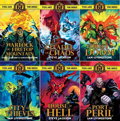
We don’t usually do news around here, unless it’s Brexit or Trump or other End Times scenarios, but there was some recent discussion in the comments about Scholastic UK’s re-release of the Fighting Fantasy gamebook series, and I kind of like the covers, so why not?

What’s good about them, first of all, is that they’re simple. These covers will have taken a fraction of the time of a full painting like Martin McKenna’s (very striking) image for Bloodbones. So they’ll be cheap, and that’s smart thinking.

On the other hand, cheap would be counter-productive if it looked cheap. Try the cover below that was proposed to me for Down Among the Dead Men by a mainstream publisher. ‘But… but…’ I said. And, when my brain regained control of my mouth: ‘It’s about pirates, not cowboys. And also it’s not a funny story for eight-year-olds.’


Thus it is that I know how utterly slapdash and dire a ‘professional’ attempt at a cover can be. By contrast, these FF covers are bold, modern and eye-catching. I can imagine them convincing today’s eleven-year-olds to give gamebooks a try.

But will those kids want to roll dice and wrangle their way through all that character-sheet arithmetic? Will the puzzle- and plot-driven adventures hold up? Will the creaky purple prose of thirty-five years past still compel attention in a videogame era? I don’t know. I just think they look pretty.

Friday, 14 April 2017

Rumble in the jungle

A picture is worth a thousand words. More than a thousand when it's by a master artist like Kevin Jenkins. So I'll keep this short. Kev has been madly busy on visual design for the next Star Wars movie - or maybe the next but one - but he cleared some time recently to do a few sketches of the cover for the seventh Fabled Lands book, The Serpent King's Domain. And when I tell you this is one of the designs we rejected, you'll get a hint of how amazing the finished cover is going to look.

Kev says of this one: "Our hero is taking down an attacker while being surprised by a second assailant, below massive jungle waterfalls with temples carved with massive stone faces." Of course we apologized for dragging him away from a galaxy far, far away but he added, "Believe me, after four years on the same subject it was nice to sketch a dragon."

An awesome guy and an awesome talent. We're lucky to have him. And anyway, I'm a Trekker.

Tuesday, 7 February 2017

A near disaster

I don’t think this merits a featured post of its own, but it’s a curiosity that might interest dyed-in-the-wool gamebook otaku. Back when Oliver Johnson and I started writing the Golden Dragon gamebooks, we were learning the ropes about book production at the same time. Manuscripts had to be ready months ahead of publication, and cover copy and artwork were usually the first thing you had to think about.

Series editor Angela Sheehan asked me to come up with a cover idea for The Lord of Shadow Keep. I tend to prefer visual imagery to prose, in fact, hence the frequent references here to movies, television and of course comic books. But I had no clear idea of what was going in the book, and when inspiration fails it really tars and feathers you. Case in point, this absolutely epic fail of a cover concept. A back view of a dark lord gazing out at the countryside in contemplative mood? What in actual frell?

Luckily the cover artist Bruno Elletori had the sense to ignore my notes and instead fix us up with a full-tilt action scene which conveyed a sense of immediate danger. All I can say is that usually I did a lot better job of coming up with a cover concept – consider Lords of the Rising Sun, for instance, or all the new Critical IF gamebooks. But when you know what you’re doing, and you still drop the ball, that’s when it lands with the most resounding of thuds.Still, it could have been worse. Check out this cover of the Berkley edition that was released in the US.
Come back on Friday for the main post, in which we’ll be taking a look at the work of a classic science fiction author whose bravura world-building makes for great roleplaying campaigns.

Sunday, 1 June 2014

Saved from the pits

The cover design for the new paperback edition of Blood Sword could have gone horribly wrong. I took it upon myself, that's why. Luckily, to our rescue came Matt Hill of Gamebooks Unlimited, who generously served up a variety of designs and patiently absorbed my comments such as, "Maybe like this but a bit edgier and with extra coolness."

This version isn't quite final. Very nearly, though. And you can see how much better and more professional it's looking than if I'd done the design. The boomalicious art of Megara's Sébastien Brunet doesn't hurt either.

The first book should be out by August, with The Kingdom of Wyrd following before the autumn. Sadly the books don't come packaged with card figurines and a full-colour tactical board like John Berry has improvised here, but maybe when we get around to the hardbacks.

Friday, 14 February 2014

In a dragon's eye

It was the early 1980s, and children's publishers really didn't know what hit them. For decades they'd been turning out nice cozy books based on their mental picture of a short-trousered scamp with a cap gun in one hand and a bottle of ginger pop in the other. In fact, even that view may be too generous. Hardly a single children's editor was male, or under forty, and mostly I think all those nice ladies just wrote boys off as not wanting to read books. Their ideal reader was sweet, quiet and mild as milk. So, not really like most girls at the time either.

They got a rude awakening. Boys did want to read books, and tomboys too - just not the books the publishers had been churning out. They wanted blood, guts, gore, mayhem, violence, and gutsy action. And most of all they wanted to be the hero.

The younger generation of editors understood this. Philippa Dickinson was twenty-six years old when she commissioned The Warlock of Firetop Mountain. A few years later, when she was publishing the Dragon Warriors series, Oliver Johnson and I were keen to stress that the covers should not give the sense of being "you know, for kids" and Philippa agreed about that. Dubious as she may have been about the buxom babes in the Alan Craddock paintings we showed her, she got that boys at that age (they were, let's face it, most of them boys, our readers back then) didn't see themselves as little kids any more. As this post by @burnedfx puts it: "Which cover would appeal to kids and which one is grandma going to pick up for little Bobby?"

Before Dragon Warriors, Oliver and I had been published by Grafton Books. I appreciated our editors there - Angela Sheehan and Gillian Appleby - but they definitely belonged to the old school of kids' publishing. I managed to get artwork by Russ Nicholson for one book, The Eye of the Dragon, and we were mostly lucky with Bruno Elletori's cover paintings, but I've ranted about that puppyish dragon logo before. And don't even get me started on the covers we were given by Pacer Books in the USA. "For young adults," said their logo (and that wasn't a term you heard much in the mid-'80s) but look at that painting in the middle! A boy in a frigging skirt. Wearing tennis shoes. Holding a little blue ball. By Azathoth, why? Especially when you consider that the rest of the image is fine, and if only little Bobby wasn't there in his pretty little dress then it could have worked.

Now compare my two covers to what Ian Livingstone got for his own Eye of the Dragon book. Okay, his came out twenty years after the Golden Dragon series, but even so. The salt in the wound is that I bet his cover cost a lot less too. As so often, less is more.
As we're talking about The Eye of the Dragon, you may be wondering why it wasn't reissued along with the other five Golden Dragon books last year. No? Well, I'll tell you anyway. Reviews by Mrs Giggles, the aforementioned burnedfx, and on Demian Katz's site point out some serious flaws in the book. Most egregious of all, it seems that the big finale depends on a one-in-three guess. Ulp.

If that's really true, I owe an apology to an entire generation, as a random choice like that would be hard to justify right at the start of a book, but is criminally wrong at the end. And while I'm checking that, and fixing it if need be, I might as well tinker with the magic system and make a bit more of the protagonist's unusual background. So The Eye of the Dragon will probably come out later this year in quite a different form. And now that there's a Fighting Fantasy book of that name, I think I'll change the title to something more interesting too. And ditch the Dungeons and Dragons brand of fantasy setting while I'm at it. And...

On reflection, it could be next year.

Saturday, 21 September 2013

Cover story

I don't know if this is actually where I'm going to go with the Bloodsword covers. Kellie Strøm has already pointed out that outlining and stretching what was already a thin font and then putting it on a busy background is pretty hard on the eyes. Maybe shading down to a darker background at the bottom would help.

Or maybe I'll try something entirely different. I'm just playing around at the moment, and most cover design goes through several extinction events before you settle on the phenotype you're looking for. As Tim Harford says, success always starts with failure. Well, strictly speaking, not always - but often. It's in that spirit that I've been fiddling with these images. (And yes, I've read my Aristotle. I do know that failure often starts with failure too.)

But one moment. Is it not quite likely that we will make Bloodsword a Kickstarter extravaganza with Megara Entertainment? If the Way of the Tiger campaign succeeds, Bloodsword is quite possibly next on the list, in which case we should end up with some beautiful colour artwork by Megara's art team.

However, I'm still thinking about doing two versions of the series (as discussed here) so that purists can have all the tactical maps and thumping great rule sets of the '80s originals, while gamebook readers with more streamlined tastes can play something more like the Critical IF series, where the emphasis is decidely more on "book" than on "game". Two editions will need to be differentiated by two styles of cover design.

Comments are very welcome - and no need to spare my feelings, either. It's just a work in progress. And, as such, it's meant to change.