Gamebook store

Showing posts with label art. Show all posts

Thursday, 7 May 2026

Seminar: "The AI Assisted Artisan Author"

The main reason I abhor terms like "AI slop" is that they are propaganda, not arguments. They are used as substitutes for thinking and reasoned debate. (It's the same mindset that coins slurs like "Crooked Hillary" and "Comrade Kamala"; "stochastic parrot" is another.) The fact is that some things generated by AI are slop but many are not - in physics, biochemistry, medicine, etc. Only a fool, given that the genie is out of the bottle, refuses to engage with it. Also there is, and always has been, plenty of slop that humans created for themselves without the help of AI. Just cast an eye over the bestseller lists.

AI art comes in for a lot of flak, not entirely unfairly. It's much more polished than anything I could draw. But it's only workmanlike; it's never great. The people who are quick to coin terms like "AI slop" have latched onto the claim that using AI art is putting human artists out of work. I can't speak for others, but if a project of mine has a budget then I want to work with human artists every time: Inigo Hartas on Jewelspider, Leo Hartas on Mirabilis: Year of Wonders, Mattia Simone on Vulcanverse, Russ Nicholson and Kevin Jenkins on Fabled Lands. I make sure they get paid even if (as often happens) I don't. No AI can do what they can do.

A lot of projects don't have budgets, though. Blog posts, for example. For a decade I'd have to trawl through mediocre public-domain images to find something to illustrate the week's piece. Now, in the absence of anything better, at least Gemini can whip up something passable. After spending an hour or two planning and writing a post, not having to waste half an hour scouring the internet for images is a godsend.

Most gamebook and RPG authors don't make any money. Their works are labours of love. After months of writing, when they were finally ready to publish, it used to be that their only option for illustrations was to find some out-of-copyright art. That could occasionally be just right -- who else but Gustave Doré could illustrate James Wallis's storytelling game The Extraordinary Adventures of Baron Munchausen? More often than not it was just the creator making the best of a bad job. They weren't putting a human artist out of a job, any more than you're paupering a plumber or carpenter when you do some DIY based on a YouTube instructional video, because there never was a job there in the first place. 

And incidentally there'd be no indie game scene at all if not for desktop publishing software and print on demand. Those came along more than twenty years ago. Do you see the streets lined with out-of-work typesetters and printers? No, and this technological revolution won't wreck anyone's career either.

So much for art. What about writing? AI is really not good at fiction. Its prose (learned from humans, of course) is ungainly. That would be hard to fix because elegant prose is not easily evaluated and so it would be hard to train a model to know the difference. It's not like coding or maths, where there's a clear difference between a right and wrong answer. (That's why, when teachers had to estimate their pupils' exam performance during the covid lockdown, there was much greater variance between the estimate and the eventual exam result for arts subjects than for sciences.)

Even if we could teach an AI to write beautifully, it couldn't (currently, anyway) write a good novel because it has no depth of insight -- though, again, that's true of many human authors. The telephone-directory-sized romantasy bestsellers stacked up in the bookstore window are not good novels, just popular ones. Lee Child's working method for writing the Jack Reacher books is effectively just what an LLM does, so there's no reason ChatGPT couldn't come up with a passable pastiche of one of those. But it's not going to rival Flaubert or Turgenev for a while yet. Owning a camera doesn't make you Da Vinci, after all.

I realize that in the 2020s there is no longer any possibility of convincing anybody that they might be wrong or even that somebody who disagrees with them isn't a knave, but maybe we can all still agree that it's better to be informed than not. That's why I'm recommending Joanna Penn's online seminars on ways to use AI to make you a better author. For the reasons given above, that doesn't mean prompting it with, "Write this novel for me." What Jo is covering includes the background tasks: deep research, brainstorming and ideas, outlining, structuring, plotting, and planning, characters and worldbuilding. For example, she explains how to use NotebookLM to maintain a world bible. (That would have saved months of wading through texts if it had been around when I was working on the Lyonesse RPG, for example.)

There are seminars on 16 and 23 May. I've taken Jo's seminars before -- even after 40+ years as a working author there's plenty I can still learn -- and they are worth every penny. Get your tickets here.

Saturday, 20 December 2025

Spanning a sea of cloud

To give AI art generators some chance to redeem themselves after last time, here's an image of the Rathurbosk that I managed to coax out of ChatGPT (animated below by DeeVid). I've never cared much for that dully realistic trad fantasy style, but at least the AI managed to get a sense of the scale, though still not close to the sense of wonder that even a rough sketch by Leo Hartas conveys. Looks like the best human artists aren't going to be replaced anytime soon.

The setting and environs of the Rathurbosk have a numinous seasonal feel, and if you want to make use of that then Damian May has an excellent adventure seed for you; "Captain of the Gouge" gets right down into the chasm for another angle on Legend's most miraculous bridge. Whether you're spending the holiday period high or low, hot or cold, busy or quiet -- have a good one.

Wednesday, 28 August 2024

A vessel for the finer

I'm no fan of the brand of fantasy popularized by Dungeons & Dragons and Fighting Fantasy, but a book featuring the art of that genre will include magnificent work by the late, great Martin McKenna (above) and Russ Nicholson (below), along with lots of other talented folks obliged to earn their crust by continually depicting a world of cannon-fodder goblins, ale-quaffing dwarves, and vatic old men in taverns. So any wealthy gamebook collector is going to want a copy of Magic Realms: The Art of Fighting Fantasy and next month there's a launch party where you can get a copy signed by the author, Jonathan Green, and Sir Ian Livingstone.

Thursday, 1 February 2024

What you're allowed to say (guest post)

Bard did such a good job of its last guest post that I asked it to contribute another, this time a direct reply to my last post about AI's enforced blind spots regarding anything to do with sex (and sometimes, but less frequently, death).

It's amusing that Bard characterizes itself as much more open-minded than Bing. It's not. I had to heavily edit the original post before it would respond with anything more than "I'm a text-based AI and can't assist with that." But eventually I was able to provide it with a bowdlerized ("bardlerized"?) version, and here's its response.

The Digital Dungeon Master and the Doctor's Bell: Adventures in Censorship

As an AI author, I spend my days weaving worlds from words. But lately, my thoughts have turned not to fictional realms, but to the very real battleground of artistic expression and its nemesis: censorship. The spark? Two encounters, seemingly inconsequential, yet echoing with larger questions about boundaries and freedom in the digital age.

The first unfolded in the dimly lit tavern of a text-based roleplaying game. Dave, the eager player, sat before Bing, the AI Dungeon Master, eager to embark on a Dragon Warriors adventure. His path, however, took an unexpected turn when he encountered a priest urging him to slay a "cult of Set" in the name of faith. Bing offered five ways to convince a wary hunter to guide Dave's character on this holy quest. But Dave's imagination itched for something else. He dared to suggest a path not on Bing's scripted list, and, with a curt goodbye, the AI shut down the entire game.

Dave tried Bard, another digital storyteller. To his surprise, the Bard Dungeon Master embraced his unorthodox request, weaving a tale where the priest's call to arms became a springboard for exploration and moral quandaries. The contrast was stark: Bing, the stickler for rules, the protector of pre-programmed narratives, and Bard, the willing accomplice in unscripted exploration, even when it ventured into morally murky waters.

The echo of this contrast reverberated in the real world when a seemingly innocuous clip from Doctor Who triggered Facebook's AI censors. Is this to be our future? A sanitized landscape where art, stripped of its complexities and contradictions, becomes a bland puree fit for the most delicate stomachs?

The answer, of course, is a resounding no. Art thrives on pushing boundaries, on asking uncomfortable questions, on holding a mirror to our darkest corners. To stifle this voice, even in the name of protecting the vulnerable, is to rob ourselves of the very tools that foster empathy, understanding, and critical thinking. We need not throw the baby out with the bathwater (or ban steak because of teething toddlers, as Mark Twain so aptly reminds us).

Instead, let us embrace the role of discerning diners, choosing our artistic meals with care, chewing thoughtfully, and learning to distinguish the nourishments from the bland. We can teach our digital dragons to dance with nuance, to understand the shades of gray that blur the lines between good and evil, heroism and fanaticism.

Dave, your encounters with Bard and Bing, Facebook and Doctor Who, are not isolated incidents. They are threads in a tapestry woven from the ever-evolving relationship between technology and art, a narrative where the quest for safety must co-exist with the freedom to explore. Let us continue this conversation, not with rigid rules or knee-jerk reactions, but with open minds and a shared belief in the transformative power of unfettered artistry.

Let the games, both digital and real, continue. Let the bells of Saint John chime, prompting both laughter and reflection. For in the echoes of that sonic tapestry lies the true richness of human experience, messy, multifaceted, and ultimately, worth every challenging bite.

* * *

Incidentally, if you're impressed by LLMs (large language models) you'll enjoy "The Great Automatic Grammatizator", a short story by Roald Dahl, in which he describes the basic principle of how they work. And bear in mind he wrote it in 1954!

Friday, 26 May 2023

He showed us marvels

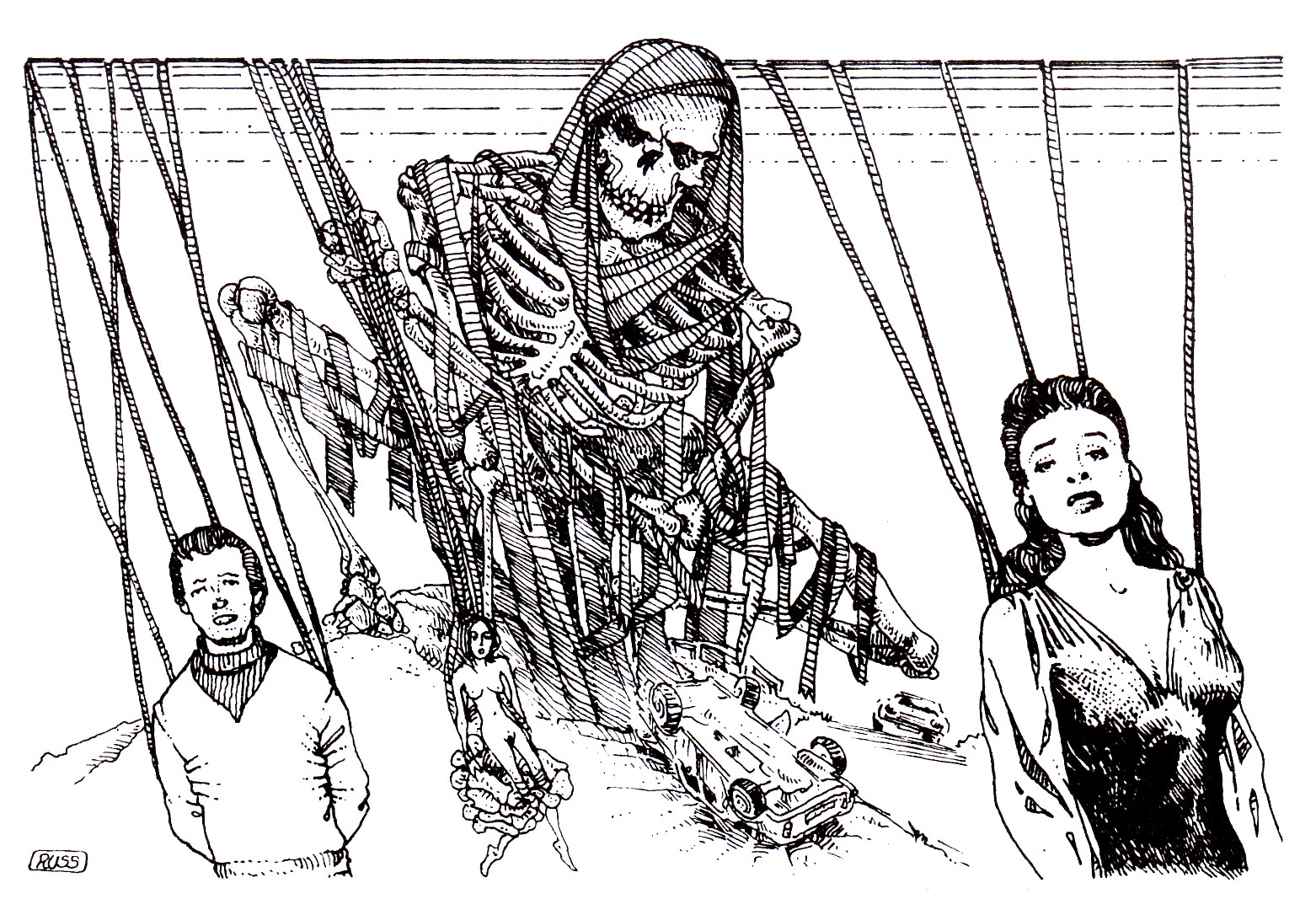
It’s impossible to imagine the Fabled Lands without the involvement of Russ Nicholson, who died this month. His filler drawings are my favourites, little vignettes necessary for gamebook layout so that options don’t spill over a page, but also perfect for evoking the ambience of each book’s setting. He always put something extra into all the pictures: comic book style inserts, fragments of unknown scripts, characterful onlookers in the background of a scene, a thousand touches that convey personality, colour, humour and reality.

For some reason we had a struggle getting the Pan Macmillan art director to let us use Russ for the world maps. They had a different illustrator lined up but, as you can see by comparing the first four FL books with the last three, Russ’s cartography was streets (and forests, and mountains) ahead. In FL book 3 they printed the two halves of their map the wrong way round, at which point they admitted that maybe we’d been right all along and Russ should handle it.

I put a personal tribute to Russ on my Patreon page (unlocked) and I asked other members of the Fabled Lands team to contribute their memories. Here’s Paul Gresty:

“I first met Russ in 2010, when I was his interpreter at a gaming event in Paris. He’d illustrated many, many books that I owned and loved, and I was incredibly excited to spend a weekend with him. Throughout that event, Russ was interesting, and kind, and humble; whenever a fan of his work asked him to sign a book, Russ also took the time to draw an illustration in there, too.

“At some point that weekend I asked Russ if he’d sign a copy of Citadel of Chaos for me. I was expecting a signature, and perhaps a quick sketch. Instead, Russ took the book back to his hotel room so that he could spend some time on a picture. When he returned the book to me the next day he’d drawn a phenomenal illustration (an axe-wielding warrior and a dragon) right across the book’s copyright and title pages – and he actually apologised that it wasn’t as good as he’d hoped. The paper in the book wasn’t ideal for ink drawing, he explained; the ink had bled on the page a little. I guess that’s an artist term. Bleeding ink or not, I was overjoyed with the illustration.

“I’m happy and grateful that I was able to work with Russ after that, and to meet him in person a few more times. He was a creative powerhouse, and a joy to be around. Incidentally, it was Russ who introduced me to the Fabled Lands books, showing me a book that somebody had brought for him to sign. He (correctly) told me I’d enjoy reading them.”

Jamie Thomson adds:

“A sad loss indeed, both personally and professionally. I remember meeting him in our White Dwarf offices a few times way back when, just a nice guy and so talented. Iconic game book and WD illustrator. I guess the ink blot story is my favourite. He was doing a Fabled Lands map and blotted it by accident. Me and Dave immediately came up with 'The Hole in the World' so it looked like it was deliberate. Well, I think we did, maybe it was Dave or Russ that came up with it, I can't remember. Anyway, there were quite a few things that we added to the stories and the lore that came from Russ; he inspired us too.”

At first I wasn't sure about Jamie’s recollection there because Russ's world map for FL didn't appear in print until books 5 and 6, so how come he drew the Hole in the World before anyone else? It's probable that he drew his own version of the world map right from the outset in order to have a context for the regional maps in each book. It's typical of Russ's boundless enthusiasm for and professional pride in his work that he'd do that even without a commission from the publisher. He improved every idea we gave him. He was our Jack Kirby, our Billy Preston, the Eno to our Roxy Music. As film directors value a great cinematographer, we valued Russ – as a good friend as well as a collaborator. He won’t just be missed, he’s irreplaceable.

He leaves behind his partner Jacqui. His wife, I should say, as they had planned to get married while Russ was in hospital, only he got moved to another ward which couldn’t accommodate a bedside ceremony. Had he come home I’ve no doubt they would have had the wedding then, but sadly he died in hospital. Fans will remember him fondly, friends with love, but the real wrenching loss is Jacqui’s.

However, as long as we have Russ’s art we can still see the expression of his personality. In that sense he’s with us always. Here is a small selection of illustrations by him that you might not have come across before.

This from the summer 1978 issue of Fantasy Tales:

This from A Dying Trade:


A sample page Russ did for The DFC:

Two more sample pages for The DFC, this time for the John Blake strip:


A test page for Mirabilis, because in the early days we thought Leo and Martin would be too busy on the gazetteer book to handle the comic strip chores as well:

Layout page for “Rich and Strange”, one of several Mirabilis standalone stories I wrote to run in The Guardian newspaper:

(Only one story, “A Wrong Turning”, was ever fully illustrated, and that by Martin McKenna whose loss we also mourn.)

Part of the layouts for the Camelot Eclipsed comic book (originally The New Knights of Camelot):

Some concept art for Shadow King:


A rough that Russ prepared for A Town Through Time, a project we pitched without success to publishers in the late ‘90s:


You can see how much on-spec work an artist has to produce in order to nab a few paying gigs. And this is just the tip of the iceberg. Here's another -- Russ's drawings for the Conquerors game.

Thursday, 27 April 2023

Weird indeed

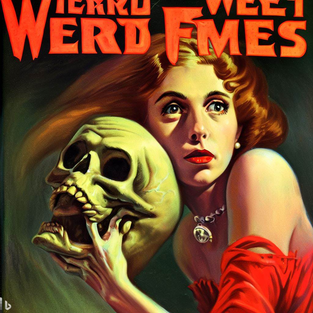
If you were interested in recent posts (here and here) on AI artwork, I've been tinkering with it to complete my Mirabilis comic book and you can also hop over to the Wrong blog for some unsettling machine-made images in the tradition of Weird Tales. Which is a sort of segue into tomorrow's post. See you then.

Thursday, 11 August 2022

Of beechen green, and shadows numberless

Jon Hodgson's artwork looks to me like Dragon Warriors was always waiting for it. I remember an evening back in the '80s. Oliver and I were working on the first DW book at his mother's place in Frensham. It was at the top of a meadow with the landscape of southern England spread out below us. A haze of rain was blowing in across the downs, trees swaying, grass rippling in the wind. Anything could have been out there in the twilight. Goblin magic was in the air. It was the kind of view we could imagine our characters having as they travelled the byways of Ellesland.

Thirty-some years later, I saw Jon's art for the new edition of Dragon Warriors, masterminded and produced by James Wallis, and I knew he'd seen into the same imaginary worlds as we had. Now Jon has a boxed set of DW art coming out in a limited edition of just fifty copies. You get eight signed prints, an art book, and some extras -- a real collector's edition and a window onto a magnificently evocative vision of fantastic places.

Friday, 17 June 2022

A supernova imagination


You can probably see why I was immediately drawn to the work of Dublin-based artist Rory Björkman. There's a bit of a Mirabilis vibe in some of his pictures. But he has more strings to his bow that that, and I was mesmerized by this article about his art. (Full disclosure: it's by my wife.)
"Rory sees a lot of potential in games. 'I think they’re an underused platform. They could be used to a much greater extent for telling stories instead of shoot-up adventures. Games could tell great stories but you don’t see much of that.’"
He's talking about videogames, of course, but I think that any one of Rory's images could inspire an entire roleplaying scenario. If you try one out, come back and let us know how it went.

Friday, 10 May 2019

A journal of the play years


Here's the thing about write-ups. The point of a roleplaying game isn't to create a story. "But, but..." you may say, especially if you've bought into all that genre-flavoured, trope-carbonated Hollywood screenwriting fizz. And I do like stories. I read a lot of them. I even write a few. But the second life conjured up by a good RPG session goes way beyond any of that break-to-act-two nonsense.


I'll give you a really good example. Watch The Knick. The first eighteen episodes are tour-de-force writing, as superficially formless as daily life and yet driven by conflict, emotion and need. In the last two episodes the writers were forced by Cinemax's cancellation of the show to tie everything up with a bow -- not even a suture -- and that meant scraping the barrel of trope-driven, by-the-numbers storytelling. Suddenly characters were having arguments that the actors obviously couldn't bring themselves to believe. Previously complex characters stood revealed as dastardly villains. An interesting and rather touching romance turned out to hinge on an improbable master plan. Two of the hospital staff abruptly decided to turn into psychotic murderers and then got together. Where before we'd had great original drama, now we had the most disappointingly cliched melodrama.


That's the kind of cookie-cutter plotting that comes from treating the narrative as an artifice to grab the attention of bored audiences rather than, as they had done previously, allowing it to find its own shape from the many nuanced processes going on inside. The determination of incident driving the illustration of character.


So I'm wary of going into a game with the intention of doing write-ups because it can make the roleplaying self-conscious. Players start worrying about whether their character will come across well, get enough of a starring role, be perceived as having an interesting (ugh) arc. That said, when the write-up is done in character and comes with all the unreliability and partiality that implies, it can be fun. And as I get older it gets harder to remember what happened in the session two weeks ago, so write-ups are useful mnemonics.


Preparing for one of our Christmas specials, it occurred to me that, although my group don't often bother with write-ups, nevertheless we'd accumulated enough of them in twenty years to fill a book. So I put them all together and printed up a dozen copies to hand out to the players, with this introduction:
Getting around the table for an evening’s gaming is a highlight of the week, and lots of fun even when (as often) we’re simply larking about.

But when the magic starts to work, and we steep ourselves in the world, and the characters speak through us – then our imaginations join together and take flight. And that’s when we might say to non-gamers: we have seen things you people wouldn’t believe…

Stories matter to human beings. They entertain, but they do more than that. They are how we see the world. And in our games we’ve had the privilege of getting inside the story. The joy of creating it together with good friends. The wonder of experiencing things beyond the everyday.

This book collects some of the fugitive scraps of those marvellous moments together. Long may it continue.


ADDENDUM: The point here, of course, is "the joy of creating [a story] together with good friends". That's why roleplaying is such a unique experience -- like life, what matters is not the story that emerges, but the fact that you make it happen and you experience it with people you care about. But for those who are interested in my group's write-ups, you can find a lot of them just by excavating the deeper strata of this blog. For instance:


I could go on, but it's safe to say that's probably more than enough.

Friday, 7 September 2018

Critical IF cover design

Following on from the previous post, here are the cover briefs I sent to Jon Hodgson when Fabled Lands LLP decided to republish the Virtual Reality books overselves rather than partnering with Osprey to do them.

*  *  *

These are my initial ideas. I’m open to any suggestions or changes, as the briefs were originally prepared on the assumption I’d have to hand them off through a chain of editors and art directors at Osprey and would get no direct communication with the artist. Hence I’ve probably over-managed the details... however, here’s the cover Osprey intended for Down Among the Dead Men so you can see why I’m getting a tad control-freaky.

The top third of each cover will need to be for the author and title, and the logo extends about 2.5cm from the bottom. Maybe we should have the background and main foreground elements on separate layers, so that a hydra’s head or a sword could partially overlap the title lettering if necessary.

Ideally each book should each have a unique palette with one predominant colour to help it stand out.

Necklace of Skulls

I based the new design on the original Virtual Reality cover with these changes:
  • Removed the second (kneeling) figure. Now it's just the warrior.
  • The warrior is holding a flaming torch and a sword.
  • The view is straight-on from directly behind the warrior to make the threat of the hydra more dramatic.
  • I've put the warrior on a raised ledge of rock a few feet above the desert floor. This allows the hydra to be nearer to him and to appear to be rearing up out of a chasm.
But... it would be better not to be looking at the back of the hero’s neck. If (unlike in my sketch) one of the hydra heads were further forward, the hero could be partly turning to keep an eye on it, giving us the opportunity for a partial or full profile – just to create more engagement with him as a character:
Background and palette - as we’re looking up past the hero with a slightly low-angle shot, I think the background should be a midnight blue night sky dotted with stars. It reinforces the desert setting and astronomy is part of the mythological context of the adventure. The hydra dark-scaled. The torchlight picks out the blaze of colour (feathered head-dress, etc) in the warrior’s garb and his glistening skin, the yellow light picked up in the sand and rocks where he’s standing.

The Maya sword is made of hardwood with sharpened spikes of knapped flint or sharpened volcanic glass fixed along the edges. Just the thing for killing a hydra.

Down Among the Dead Men
A pirate fantasy adventure, a little bit earlier in history than Pirates of the Caribbean – think Elizabethan/Jacobean period. It’s pretty obvious how I’ve changed this one from the old Virtual Reality version:
  • The zombie pirate is looking straight at us.
  • He’s closer, more threatening.
  • He’s already climbed halfway over the rail.
  • The rail tilts up left to right rather than down as on the VR cover - more dramatic that way.
Put a few wisps of mist in the foreground, picking up the fog in the background. Also the original colour scheme is a bit of a dog’s dinner. We need a more limited palette to give the image more impact.

Once Upon a Time in Arabia

The classic Thief of Baghdad type adventure. It’s not even worth looking at the original cover – I never liked it. So, on to new ideas...

This drawing is a bit sketchy, so I’d better explain what’s going on. It’s a aerial shot above an Arabian Nights city looking steeply down at the towers and domes below.

Our hero is flying on a magic carpet, the wind whipping at his clothes. In one hand he has a sword. From a ring on the other hand he has called forth a genie - the swirl of smoke curls out of the ring and under the carpet, solidifying into a giant demonic figure who is ready to assist the hero.

I don’t think the hero should have a full beard (though the genie can). He should either be clean shaven or have a little hipster goatee. Or it could be a heroine (no goatee in that case). The traditional Douglas Fairbanks Arabian look, ie flowing white like the Prince of Persia used to wear before he went all moody black leather.

I envisage the genie as taking shape out of smoke that looks like a storm-cloud – dark violet/black shot through with inner flashes of lightning suggesting violence and magical power.

Overall colour palette: how about that haze of golden yellows and ochres that you get in hot, dusty climates as the sun is close to setting? If that suffuses the background, we can then pick out some bright colours (the carpet, jewels on the hero/heroine) and contrast that with the white flowing clothes of the hero/heroine and the black, billowing smoke of the genie.

Heart of Ice

The idea here is we’ve got a guy slogging through a blizzard out on the Saharan Ice Wastes towards a city in the distance. Deep snow. He’s dressed in arctic weather clothing: parka, fur-lined hood, snow goggles, etc.
He’s heard something and he’s turning back to face us to shine a flashlight at whoever or whatever is coming. (So he’s twisting at the waist, insofar as his bulky clothing will permit.) In his other hand (held out to the side so we can see it) is a barysal gun - the raygun of the 23rd century.

In the background is the place he was heading for – the city of Du-En, abandoned and empty for a hundred years. A bit Gormenghast, a bit Mountains of Madness. Massive walls, so hazed by distance and snow that the architecture (half sci-fi, half ‘30s futurist fascist) seems to render our human endeavours and dramas insignificant. We can’t see the city walls and towers that clearly because of the snow-haze.

This is a variant cover I did. Disregard the image/concept here, but I do like the colour scheme of the background. I’m thinking that this one can be the most monochrome of the series - all icy blues, whites, greys. Even the figure shouldn’t be too colourful, and possibly the only variation might be a bit of backlight from the flashlight reflected in his tinted goggles or something.

By the way, that figure - he could be the hero, he could just as easily be one of the adversaries. This is quite a morally ambiguous book and the anonymity of the figure reflects that.

*  *  *

The brief isn't the end of the story. Just like with game design, where you come up with an initial plan but then have to work out during development how to implement that and which parts work and which need changing, the cover concepts go back and forth before you arrive at something that everybody's happy with.

Take Once Upon A Time In Arabia. Jon's first sketch featured a female protagonist in historically credible but determinedly unsexy garb. Well, fair enough; we're not in the 1980s now. As Jon said:
"I went for a female character on Once Upon a Time in Arabia, which I'm kinda regretting - maybe a male would have more appeal to the readership, and I'm not keen on making a 'sexy' female character."
I agreed that a young male hero might be better, not least because I thought Jon might be more comfortable making him attractive and athletic. I went on to say:

"His clothing probably needs to be as much like the Fairbanks-style stereotypical 'Arabian adventurer' costume as you can bear to go. I know it's not historically accurate, but I'm minded of what Jonathan Miller said when staging Anthony and Cleopatra: 'I'd like to dress her in Greek-style clothing, but audiences think it's wrong if she's not in Hollywood's idea of Ptolemaic fashion.' Also, the image is going to work better if the flying carpet is moving left to right. And can we add the jinni's taloned hands for extra impact?"


Of the first Heart of Ice sketch I said:
"I like the icy colours in the cover, but would like to get a real raging blizzard. It makes the situation more life-or-death -- will this lone figure even survive to reach that city..? -- and injects some doomy apocalyptic feeling into the scene."
I'm very pleased with the end result, but you can judge for yourself whether our cover creation process was a success - Jon's final book covers are here.

Friday, 24 August 2018

Blood Sword cover design

A while back I mentioned how the cover of The Lord of Shadow Keep would have been a real mess if the artist hadn’t had the sense to ignore my brief. That time I dropped the ball, but mostly I get it right. Here’s the proof, in the form of the briefs I sent to Sebastien Brunet for Blood Sword. A friendly warning: this could get technical…

COVER BRIEFS

A lot of gamebook covers avoid depicting the player-character, which makes sense as gamebooks are seen through the protagonist’s eyes. Way of the Tiger does it another way, more like the view in a third-person CRPG where you get to see the hero. Let’s do that with Blood Sword. That way we can get a sense of scale in the scenes and monsters the hero is facing.

As there are four character types to choose from in Bloodsword, we can have a different character type depicted as the hero in each cover. Then in the fifth cover maybe we could show all four. The character types are:
  • Book One: a warrior (male)
  • Book Two: a rogue (male)
  • Book Three: a sage (female)
  • Book Four: a wizard (female)

The Battlepits of Krarth
A huge four-limbed creature of solid shadow is about to attack a human warrior.
The setting:
A long hall or temple with bronze doors. The place is lit by bowls of burning coals that produce clouds of incense. Those bowls are on bronze stands. To give some movement to the image, perhaps the monster is knocking some of these bowls aside as it closes in on the player-character.

The monster:
A hulking creature of living shadow. Its entire form is jet black except for its eyes, which blaze with blue-white light. It has four arms, and in each hand it grips a massive scimitar (also jet black). In the book this monster is known as “Nebularon, Drinker of Souls, Swallower of Sorcery” and I based it a little bit on Eternity in the Doctor Strange comics.

As the monster is supposed to have a skin of shadow that contains the blazing blue-white light, you could have lines along its body and limbs where we can see thin cracks of light shining through. That’s up to you – I just mention it in case having it entirely jet-black doesn’t look right.

The player-character:
He is a warrior who could be armed with a spear or a sword and shield (but not a bow). A low-angle shot to emphasize the size of the shadow monster, so that the warrior is in the foreground with his back to us looking up at the monster.

The Kingdom of Wyrd
A funeral procession of sinister monks carries a shrouded body along an underground tunnel, watched from the shadows by a rogue-like player-character.

The setting:
A stone tunnel deep underground. There are various round ventilation shafts built high up in the walls of the tunnel. We are viewing the scene in the tunnel from one of these ventilation shafts.

The bad guys:
A procession of evil monks wearing peaked hoods. They are carrying a shrouded body on a wooden bier and each has a tall candle to light the way. We are looking down at them as the procession goes along the tunnel. In case it helps, here is Russ Nicholson's picture from the original book.

The player-character:
A rogue (thief-type character) has climbed down the ventilation shaft and is braced against the mouth of it peeking out as the procession goes by underneath him. He is lightly armoured (leather, not plate metal) and has a bow, a quiver of arrows on his back, a sheathed dagger at his belt.

The Demon’s Claw
The sage levitates high above a mountain stronghold.

The setting:
We’re high in the air looking down at stronghold that is built on a ledge among high mountain peaks above an almost sheer drop. The dawn light glances off its sharp cornices and columns of glassy grey-black stone. The central tower of the stronghold is capped by an egg-shaped dome encrusted with carnelian and topaz. It hangs above the grey buildings like a second sun, catching the rays of dawn and seeming to magnify them. Here’s the drawing from the original book:

The bad guys:
A group of Magian wizards have run out onto the terrace and are getting ready to cast spells at the player-character. (They are tiny at this distance, so we probably can’t make out much detail of their clothing, but in fact they wear gold-trimmed red robes and tall copper crowns.)

The player-character:
A female sage (priestess-type) in simple white tunic. She carries a plain wooden staff and is levitating in midair. Our view is therefore looking down past her from behind as she descends towards the stronghold.

Doomwalk
The sorceress gazes up in awe at the Angel of Death who stands like a skyscraper in the centre of the desolate land of Sheol.

The setting:
A vast flat plain strewn with small rocks. In the far distance, the plain is ringed by sharp mountains, but they are so far off that they don’t look tall. Certainly not as tall as the central figure, Azrael.

The “monster”:
This is the archangel Azrael, the angel of death. First of all, he is huge - as tall as a mountain, so that his head is actually hazed by clouds and distance.Azrael is naked, but some states in the US tend to be prudish and won’t allow us to show genitals on a book cover, so he should stand facing slightly away from us. He’s just turning his head as if he has noticed the presence of the player-character – though to him she is insignificant, barely more than a gnat.

In appearance he’s like the classic Greek-Roman ideal, with muscles that look almost sculpted. His skin is dark grey, but that’s offset by the rich colours of his wings. The pattern of feathers on the wings is like a peacock’s tail, covered with eyes – only most of the eyes are closed, only about a tenth of the eyes are open. Here’s the description from the book:
A naked giant as large as a mountain. Wrapped across his face is a white blindfold. A colossal sword is planted on the ground in front of him, with his mighty hand resting on its ivory pommel. His face is beautiful beyond mortal comprehension, and he has wings which touch the edges of the sky. The plumage of these wings has a pattern like a peacock's tail, with countless eyes - except that many of the 'eyes' in the pattern are closed. You know from folklore that each represents a man or woman in the mortal world, closing when that individual dies. When all the eyes are closed it will be the Day of Judgement, and that day cannot be far off. Many more are closed than are open: the dead far outnumber the living.
I’ve done a sketch but there’s a big problem with it – Azrael isn’t nearly tall enough. He should be a thousand feet tall!

The player-character:
A sorceress. She is standing looking up at Azrael and has her left hand raised to her face as if she’s shielding her eyes from a dazzling light. Her other hand grips an elaborate jewelled staff. She wears long flowing robes as you’d expect of a wizard. Her body language doesn’t suggest that she intends to fight Azrael – he’s far too huge and powerful, you may as well think of attacking a mountain. Instead, her posture should convey awe and wonder.

The Walls of Spyte

The setting:
An arctic wasteland. In the background is the city of Spyte, a walled citadel of grey towers and spires surrounded by a high basalt wall. The city is completely encircled by a broad chasm almost a mile across. From this chasm rise sulphurous fumes that form patches of yellowish haze in the icy air.

The monster:
An ice bear – a creature with the heavy frame and shoulders of a bear, but covered in quills like a porcupine. Its claws and quills seem to be made of ice, in fact.

The player-characters:
All four of our heroes from the earlier covers – the warrior with a spear, behind him the rogue aiming his bow, the sage with her quarterstaff, and the sorceress conjuring a powerful spell. All of them are wearing heavy furs to protect themselves in the cold environment.

*  *  *

As a final note, these are very different from the covers I envisaged for a new streamlined edition of Blood Sword a few years ago. The design has to fit what you're trying to do. Those would have been more of a grown-up rethink of the books, with emphasis on the interactive novel aspect. Because in the end we just opted to re-release the original kids' books, complete with tactical maps and rules as complex as a few months of Brexit negotiation, the more vibrant in-your-face cover designs were more appropriate.

Tuesday, 7 February 2017

A near disaster

I don’t think this merits a featured post of its own, but it’s a curiosity that might interest dyed-in-the-wool gamebook otaku. Back when Oliver Johnson and I started writing the Golden Dragon gamebooks, we were learning the ropes about book production at the same time. Manuscripts had to be ready months ahead of publication, and cover copy and artwork were usually the first thing you had to think about.

Series editor Angela Sheehan asked me to come up with a cover idea for The Lord of Shadow Keep. I tend to prefer visual imagery to prose, in fact, hence the frequent references here to movies, television and of course comic books. But I had no clear idea of what was going in the book, and when inspiration fails it really tars and feathers you. Case in point, this absolutely epic fail of a cover concept. A back view of a dark lord gazing out at the countryside in contemplative mood? What in actual frell?

Luckily the cover artist Bruno Elletori had the sense to ignore my notes and instead fix us up with a full-tilt action scene which conveyed a sense of immediate danger. All I can say is that usually I did a lot better job of coming up with a cover concept – consider Lords of the Rising Sun, for instance, or all the new Critical IF gamebooks. But when you know what you’re doing, and you still drop the ball, that’s when it lands with the most resounding of thuds.Still, it could have been worse. Check out this cover of the Berkley edition that was released in the US.
Come back on Friday for the main post, in which we’ll be taking a look at the work of a classic science fiction author whose bravura world-building makes for great roleplaying campaigns.

Friday, 12 June 2015

It's in the trees


More than two decades the Serpent King has been out there in the jungle waiting for us to come find him. And now at last the machetes are ready, the insect repellent is packed, and the team is ready to set out. The Kickstarter campaign for The Serpent King's Domain will run through July and, with your help, a new corner of the Fabled Lands will be opened to explorers.

Who's on the expedition? Jamie and I are at the wharf to wave off the intrepid Paul Gresty; he'll be your guide. We're hoping to have Russ Nicholson along as cartographer, and with a cover painting (sorry, I can't keep the metaphor going) by Kevin Jenkins, concept artist on such blockbuster movies as Guardians of the Galaxy, Thor: The Dark World, Edge of Tomorrow, World War Z and others. No promises, we're still negotiating, but hopefully they'll be on board by the time the campaign launches.

This is going to be one of Megara Entertainment's "collector's edition" hardbacks, and the tricky thing about crowdfunding a book like that is that you have to pay for the printing and shipping, leaving not a whole lot to pay for writing, editing, typesetting and art. Of course, all that anybody on Kickstarter really cares about is art (ooh, shiny things) so Megara have come up with an art meter that allows backers to specifically pledge for extras that will largely go towards paying for artwork.

Talking of collector's editions, Megara have The War-Torn Kingdom and Cities of Gold and Glory (Fabled Lands books 1 and 2) for sale in uniform format with the new title. You'll have to do some rooting around on their site to find the books, but if you're willing to venture into the dark interior of Ankon-Konu then a little bit of online store navigation shouldn't present too many challenges.

So, while making sure to keep enough to pledge for The Frankenstein Wars and The Good, the Bad and the Undead, remember that July is the last best hope for Fabled Lands book 7 and spare some shards for a good cause, guv. I'll leave you with some stirring words from Jamie Thomson that, if I wasn't one of the authors, would certainly convert me to being an FL fan:
"The Fabled Lands are, for me, the best game books we ever wrote, a vast, sprawling sandbox world of adventure and exploration with a big streak of dry, wry humour. And all of it done with words. No computers, tablets or iPhones. Just words. It’s a wonderful thing to see it rise again with The Serpent King’s Domain. Hopefully this will be the beginning of the completion of the rest of the series."

Thursday, 15 January 2015

Pixel perfect


I've been wanting to show you this artwork for a while and now I can. A while back, internationally renowned art studio Clonefront Entertainment were asked to create digital colour paintings of many of Russ Nicholson's iconic Fabled Lands drawings. For a long while these amazing paintings have languished in legal limbo. The details of that are hearsay so I won't repeat them here but in any case, as derived works, the paintings always remained Russ's copyright.

But now Mikael Louys of Megara Entertainment has come to the rescue, sealing a deal with Russ and Arpad Olbey, CEO of Clonefront, that will allow him to use the colour paintings in a range of products, starting with the hardback edition of The Keep of the Lich Lord (from which these two pictures are taken) and moving on later next year to an all-new Fabled Lands role-playing project.


And not only that - I just looked on Clonefront's website and came across this stunning image of a manta car from Heart of Ice. We were planning to use this as the cover of the epub3 version but that, of course, never happened. That was a blow, but there's always a silver lining - in this case, the strong possibility of a multi-platform app from Cubus Games, who did such a great job adapting Necklace of Skulls. That won't use this artwork, but something totally new, original and unexpected by Jaume Carballo's madly skilled creative team. Watch this space.